3. Designing for Users Means Respecting Attention
A sticky note asks you to process one idea at a time. It forces focus by naturally strip things down to what matters most.
Software should do the same. Instead of cramming everything at once, surface only what matters right now. For example, when building a Power BI dashboard, a common mistake is to cram every metric into one view (sales, operations, finance, forecasting). The thought here is that that more data = more value, but in reality, that overload paralyzes decision-making.
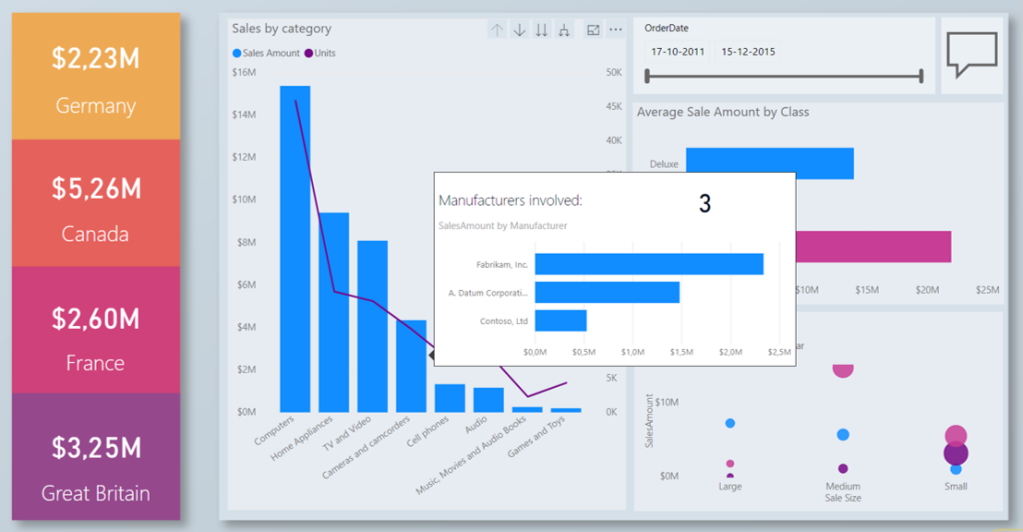
The best dashboards take the opposite approach: progressive disclosure. Start with a few of the must-know KPIs (like revenue and margin) and let users drill deeper only if they need to. Power BI’s report page tooltips are a perfect illustration. Rather than cluttering the main dashboard with extra graphs, you can design a custom tooltip that appears on hover (like showing the number of manufacturers involved for a specific category as referenced in the graphic). This keeps the focus on the bigger picture, while making richer context available on demand.
Try spotlighting what matters now, then pacing the rest, so attention doesn’t go full squirrel mode. When you respect attention, clarity rises, and suddenly decisions get made faster.


